- For icons used as part of Google Doodles, see Google/Doodles/Icons.
| 1999–2008 | 2008–2009 | 2009–2012 | 2012 |
| 2012–2014 | 2014–2015 | 2015–2025 | 2025–present |
1999–2008
| SVG NEEDED |
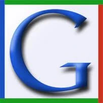
Google's favicon from December 16, 1999 to May 30, 2008, was a blue, uppercase "G" on a white background. It was accompanied by a border with red, blue, and two green sides.
2008–2009
| BETTER LOGO NEEDED |
")
On May 30, 2008, a new favicon was launched. It showed the lowercase "g" from Google's 1999 logo, colored in blue against a white background, and was originally intended to be a part of a larger set of icons developed for better scalability on mobile devices.
2009–2012
| SVG NEEDED |
.svg "Google Favicon 2009 (3D).svg (2 KB)")
A new favicon was launched on January 9, 2009. It included a left-aligned white "g" with background areas colored in red, green, blue, and yellow, with the top, bottom, and left edges of the "g" slightly cropped. It was based on a design by André Resende, a computer science undergraduate student at the University of Campinas in Brazil. He submitted it for a contest launched by Google in June 2008 to receive favicon submissions. The official Google blog stated: "His placement of a white 'g' on a color-blocked background was highly recognizable and attractive, while seeming to capture the essence of Google". This icon still appeared on some pages for a few years after the following logo's introduction.
2012

The favicon used from August 13, 2012, to August 19, 2012, showed the small letter "g" in white, centered on a solid light blue background. This icon looks like an inverted version of the 2008 flat icon variant.
2012–2014

On August 20, 2012, the icon was slightly modified.
2014–2015

On May 24, 2014, Google's icon was slightly updated, with the 'g' moved right one pixel. This icon was used until 2015. With this, Google's layout was fully redesigned. Shortly on September 1, 2014, to coincide with Android Lollipop's release, Google introduced the new "Google dots".
2015–2025
")
")
.svg "Google Now (2015-2023, HD).svg (254 KB)")
| LOGO MISSING |
Following its logo change in 2015, the new Google icon now uses an uppercase "G" (similar to the 1999 logo) with the four colors from the new main logo.
Search icons
")
")
2025–present
On May 12, 2025, a new icon was introduced for Google Search, with brighter colors and using gradients instead of solid blocks, referred to as "Super G" internally. This would be later revealed to be a part of the rollout of Google's new "AI Mode", via a July 1st Google Doodle. Which despite its continued use, features the 2015 Google wordmark transitioning into the new icon.
On September 30, it was announced that other Google products would begin to incorporate this rebrand, with the first being Google Gemini.[1]
")
")
")
")
References
| Part of Alphabet Inc.
Staple services
Google Play Platforms & Services
Hardware
Development & Enterprise
Hoaxes Other Former Defunct Notes
|


| Current subsidiaries: Calico | capitalG | DeepMind | Google | Google Fiber | GV | Isomorphic Labs | Sidewalk Labs | Verily | Waymo | Wing | X
Former assets: Notes
|