This page only shows primary logo variants. For other related logos and images, see:
|
| 1956–1973 | 1963–1973 | 1973–1984 (Italian); 1986 (French) | 1981–1984 (secondary) | 1986–1988 | 1988–1990 | 1990–1992 |
| 1992–1993 | 1993–2002 | 2002–2003 | 2003–2009 | 2009–2016 | 2016–present | |
Télé Monte Carlo, better known as TMC, is a French–Monégasque TV channel originally launched as the national TV channel of the Principality of Monaco (also the first private channel of Europe) in 1954, but since acquired by Groupe TF1, the largest TV broadcaster in France. Monaco continued to own a stake in the channel until 9 June 2016, when TF1 Group acquired it in full, though it remains the national channel of Monaco.
TMC complements TF1, TFX and TF1 Séries Films as one of the four main free-to-air channels of the group. It is always broadcast on channel 10 throughout France, which is reflected in its on-air branding since 2016.
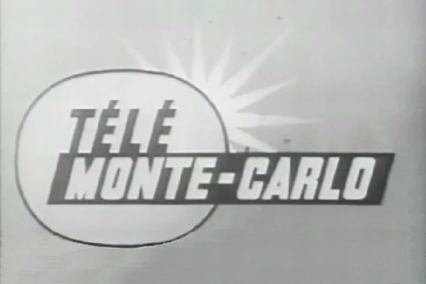
Télé Monte-Carlo
1956–1973
| SVG NEEDED |
1963–1986
1963–1973
| SVG NEEDED |
1973–1984 (Italian); 1986 (French)
This logo was still used in the sign on/off idents until 1986.
1981–1984 (secondary)
| SVG NEEDED |
1986–1990
1986–1988

1988–1990

1990–1993
1990–1992

1992–1993
Monté-Carlo TMC
1993–2002

|
|
|
TMC (first era)
2002–2003

|
|
|
On 2 March 2002, TMC was relaunched with new schedules and a new look, created by Gédéon.[1]
- "You will discover our new logo: round, warm and red, with a crescent sun and TMC lettering which leans forward. It is the new image of the channel: energised, modernised, rejuvenated and more feminine, but still very at home under the Mediterranean sun." - TMC website in 2002
However, this logo and look were short-lived, and were replaced the next year.
TMC Monté-Carlo
2003–2009
|
|
|
A new look, created by Aart Design, was launched on 21 March 2003, barely a year after the previous graphics.
- "The new visual identity reflects the metamorphosis of TMC and introduces its new general concept 'Luxury for everyone'. Losing the prefix 'tele' and the baseline 'Monte Carlo', TMC becomes a metaphor embracing a wider idea of elegance and luxury.
- Two leaning ellipses, large typography and an illusion of movements along with light flow, create depth, dynamic character and accentuate TMC's position as an expandable and at the same time open to the world channel." - Aart Design
TMC (second era)
2009–2016

|
|
|
On 16 February 2009, TMC introduced a new logo and look, designed by the French studio Dream On. The idents featured the TMC logo acting as a push-button; on the button being pushed, the scenery changed dramatically. Flama was the on-screen typeface.
2016–present
")
")
|
|
|
Some months after Groupe TF1 acquired the entirety of the channel from Monaco in June 2016, TMC unveiled a new logo and look on 12 September 2016 during the première of Yann Barthès’ talk show Quotidien.
The graphics package was designed by Superestudio of Buenos Aires, Argentina, who also designed the look for sister channel NT1 in 2018 when it became TFX. The graphics package emphasises the channel’s traditional location (10) in programming guides by ‘twisting’ the logo into the number 10. The ‘twist’ concept is carried over to the idents, where one out of ten objects is treated differently.
The graphics package makes use of three fonts: Gusto Black, a heavy sans-serif; Youngblood, a free calligraphic font; and Campton, which is known for its use by Germany’s ProSieben since 2015.
The logo is based on their 1992 on-screen bug which is very similar.
On October 28, 2024, the channel (only the idents) along with TFX (only the visual identity), were rebranded with new idents and new ad bumpers that were created by Artificial Intelligence (AI), something that sparked outrage from angry viewers and graphic designers.
Footnote
- There were two other TV rebrands in Europe besides TMC on 12 September 2016: N24, a German news channel (now Welt) and Italian public broadcaster Rai.
| Part of Bouygues
Television channels: News programs: Content productions and distributions: Advertising companies and platforms: Teleshopping platforms: Digital and multimedia assets: Other assets: Former assets Disbanded: Teleshopping | Eurosport6 | France 24 (50%)2 | AB3 (49%)4
1Joint venture with Groupe M6.  |
| Eurovision/Euroradio ARD (Germany) |
ARMR (Armenia) |
ARMTV (Armenia) |
Arte (France / Germany) |
BBC (United Kingdom) |
BHRT (Bosnia and Herzegovina) |
BNR (Bulgaria) |
BNT (Bulgaria) |
C4 (United Kingdom) |
ČRo (Czechia) |
ČT (Czechia) |
CyBC / RIK / RKYK (Cyprus) |
DR (Denmark) |
ENRS (Algeria) |
EPTV (Algeria) |
ERR (Estonia) |
ERSL (Luxembourg) |
ERT (ERA) (Greece) |
ERTU / NTU (Egypt) |
GPB (Georgia) |
FMM (F24 | MCD | RFI) (France) |
France.tv (France) |
HRT (HR) (Croatia) |
İCTI (İR | İTV) (Azerbaijan) |
JRTV (Jordan) |
Kan (IPBC) (Israel) |
LNC (Libya) |
LRT (Lithuania) |
LSM (Latvia) |
MMD (Monaco) |
MRT (North Macedonia) |
MTVA (Duna) (Hungary) |
NPO (Netherlands) |
NRK (Norway) |
NSTU (Ukraine) |
ORF (Austria) |
PBS Ltd. (Malta) |
PR (Poland) |
RAI (Italy) |
Radio France (France) |
ROR (Romania) |
RT (Tunisia) |
RTBF (Belgium) |
RTCG (Montenegro) |
RTÉ (Ireland) |
RTL (Luxembourg) |
RTP (Portugal) |
RTS (Serbia) |
RTSH (Albania) |
RTVA (Andorra) |
RTVE (Spain) |
RTVSLO (Slovenia) |
RÚV (Iceland) |
SMRTV (San Marino) |
SNRT (Morocco) |
SRG SSR (Switzerland) |
SRT (SR | SVT | UR) (Sweden) |
STVR (Slovakia) |
TDA (Algeria) |
TG4 (Ireland) |
TL (Lebanon) |
TRM (Moldova) |
TRT (Turkey) |
TVM (Monaco) |
TT (Tunisia) |
TV 2 (Denmark) |
TV 2 (Norway) |
TVP (Poland) |
TVR (Romania) |
UKIB (ITV | S4C | STV) (United Kingdom) |
VR (Vatican City) |
VRT (Belgium) |
Yle (Finland) |
ZDF (Germany) Associated members Approved members Competitions Awards ceremonies Defunct/cancelled competitions  |