The National Broadcasting Company (NBC) is an American television network owned by Comcast through its media subsidiary NBCUniversal. Originally founded on May 19, 1926, as a radio network, its television network launched on April 30, 1939. It is the oldest broadcasting network in the United States.
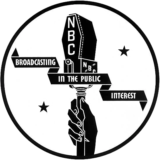
1926–1931
Designer:
David Sarnoff
Typography:
Custom
Launched:
November 15, 1926
NBC, founded as a subsidiary of General Electric, debuted as a radio network on November 15, 1926.
1928–1931 (secondary), 1931–1942 (primary)
1942–1943 (secondary)
SVG NEEDED
This logo was used on NBC's print materials during 1942-43.[1]
1942–1946 (primary), 1946-1953 (secondary)
Designer:
In-house
Typography:
Custom
Launched:
Q2 1942
The lightning on the left side represented NBC's radio network, and the waves on the right side represented its television network. Lightning bolts were also a key part of corporate parent RCA's emblem, as well as that of one-time sister company RKO Radio Pictures.
Despite being replaced by the 1946 and 1952 logos, this was used to identify the company as late as 1952,[2] and was used as the NBC Radio Network logo until 1953.
This logo can be seen on NBC's Meet the Press Washington Bureau offices.
This logo would usually be shown at the end of a program with a rounded rectangle border around it. After years of identifying the radio network, the famous NBC chimes made their television debut as part of this logo, with each letter illuminating in order with each chime. This sequence would continue with the next logo. Despite being replaced by the 1952 logo, this logo was still present on the "NBC Television Presents" logo until 1960.
1952–1953 (primary), 1953–1966 (secondary)
Designer:
In-house
Typography:
Alternate Gothic (modified)
Launched:
January 14, 1952
The first known appearance of this logo was on the first broadcast of the Today show aired on January 14, 1952.
Despite being replaced in 1953, NBC continued to use this logo on its kinescopes. The latest known use of this logo was on the two known pilots of It Had to Be You taped on November 7, 1966.[4]
1953–1959
Designer:
In-house
Typography:
Alternate Gothic
Launched:
December 17, 1953
In 1953, a stylized xylophone and mallet were introduced, symbolizing the NBC chimes, which were first heard on NBC radio in 1927 as a seven-tone sequence. The current tones, which were first adopted in 1929 as a simplified cue for identification of its radio affiliates because of issues with orchestrating the seven notes properly, are only three notes, G, E', and C'. There is some indication that the xylophone logo was used at 5:32 p.m. Eastern Time on December 17, 1953, to announce the Federal Communications Commission's (FCC) approval of the new color standard, which would go into effect 30 days later. This logo debuted in December 1953, during the Tournament of Roses Parade.
1956–1975
Designer:
John J. Graham Herb Lubalin
Typography:
None
Launched:
May 22, 1956
In 1955, John J. Graham and Herb Lubalin of Sudler & Hennessey designed a new symbol for the network: an abstraction of an eleven-feathered peacock indicating richness in color. This brightly hued peacock, which NBC called the "Bird", was adopted due to the increase in color programming. Several modifications were made by NBC before the emblem made its first on-air appearance on May 22, 1956. Its most famous on-screen iteration would come in 1962, when a new animated network ID debuted before an episode of the western Laramie. This association led this ident to be dubbed the "Laramie peacock", and would continue to be used until 1975.
Starting in late 1959, a new animated logo designed by John J. Graham joined the Peacock logo, appearing at the end of every show. Starting with the "N", each letter would grow from the other, forming a stacked typographic logo featuring an "NB" ligature with the "C" forming the base. This would be known as the "NBC Snake". Several versions of this exist; the first is the snake forming in front of a multicolored background while an RCA TK-40 or TK-41 camera passes by with a jazz rendition of the NBC chimes, while the second consists of the snake forming against a color-changing background, going from blue to green to red, on each note of the regular, automated NBC chimes.
October 1975 (teaser) December 30, 1975 (press unveiling)[6] January 1, 1976 (first use)
NBC announced an update to its image in October 1975, with the introduction of an abstract "N", a bold, bright, and contemporary design consisting of two trapezoids – one red and one blue. It made its on-screen debut on New Year’s Day, 1976. One of the technological innovations of this logo was its use in the first electronically animated idents for an American television network.
In February 1976, Nebraska ETV, the PBS member network for Nebraska, filed a trademark infringement lawsuit against NBC. The new NBC logo was virtually identical to the logo that Nebraska ETV had been using since June 1975, with the only cosmetic difference between the two designs being that the right trapezoid of the NBC logo had blue coloring. An out-of-court settlement was reached in which NBC gave Nebraska ETV over $800,000 worth of new equipment, including a color mobile unit. It also paid Nebraska ETV $55,000 to cover the cost of designing and implementing a new logo. In return, NBC was allowed to keep the "N" logo.
This logo was still used in tandem with the 1979 and 1985 peacock logos on KOAA-TV and WEAU into the 1980s.
1979–1986
Designer:
Tom Carnase, Ted Szumila, Gene Kolomatsky
Typography:
ITC Serif Gothic Bold Helvetica Bold
Launched:
1978 (creation) September 10, 1979
The Peacock returned as part of NBC's branding on September 10, 1979. The "N" and an updated Peacock were combined to create a design called the "Proud N". On several occasions, the new, simplified Peacock was used on its own, starting with the new "Proud as a Peacock" advertising campaign; however, the "N" and the Peacock were usually combined. Unlike the original Peacock design, which featured eleven colors, this iteration only used six colors for all eleven feathers.
It was intended to be a transitional symbol while the "N" was being phased out, as Fred Silverman, president when the logo was introduced, felt the peacock indicated pride in their programming.[7]
After the official introduction of the next logo, this logo was slowly phased out. On-screen, the 1986 logo was slowly phased in during July and August 1986[8][9], and press photos phased this logo out by the fall.[10][11]
On January 15, 2026, this logo was briefly reused as part of their 100th anniversary.
1980 (creation) August 26, 1985 (first use)[12] May 12, 1986 (public reveal)
In 1980, NBC's parent company commissioned Chermayeff & Geismar to redesign the peacock logo. The result, designed by Steff Geissbuhler, went unused for several years as NBC was ranked the lowest among the "Big Three" networks in the ratings, and wanted to hold off on rebranding until it retook the number one spot.[13] Furthermore, it should be noted that the previous logo had only been in use for a year at the time, so rebranding from it so soon would not have been seen as necessary by the viewing public.
The logo saw selective onscreen use beginning in the fall of 1985[14], and was officially unveiled on May 12, 1986, during the finale of the NBC 60th Anniversary Celebration special, when past and present NBC stars stood on stage to introduce the simplified peacock icon, ending the arranged "marriage" of the "N" and the peacock. The peacock's head was now flipped to the right, as if to suggest it was looking forward to the future rather than back to the past, and the white plume on its head was eliminated. The bottom portion now also resembles a film canister. The peacock's feathers are now shortened to six and include the six primary and secondary colors in the RYB color palette to represent NBC's six divisions: yellow for news, orange for sports, red for entertainment, violet for stations, blue for network, and green for productions. This peacock remains one of the world's most recognized logos; it is still used for several divisions of NBC Sports.
The network maintains specific guidelines for the logo, including proper colors for reproduction, using either RGB, CMYK, or Pantone colors. A new typeface was also introduced: NBC Futura, still used for some affiliates and some of its divisions, such as its Spanish-language network Universo. The font's main difference from the actual Futura, the pointed "N" letterform, is meant to recall the old "N" symbol.[13]
2009–2011
Designer:
Capacity
Typography:
None
Launched:
September 14, 2009
On September 14, 2009, a gradient was added to the 1985 logo for use in NBC's "More Colorful" campaign, though the 2006 color bug used for HD programming remained. It was later used for NBC News until 2023.
2011–2013
Designer:
Unknown
Typography:
None
Launched:
May 2011
In May 2011, NBC introduced a glossy 3D version of the 1985 logo for use in promotional advertising and idents. However, the 2006 color bug used for HD programming, the 1986 logo, and some elements of the "More Colorful" rebrand remained in use. After its introduction, a few NBC stations incorporated the glossy variant into their station logos, with the owned-and-operated Chicago station WMAQ-TV being the first to do so in February 2012. Contrary to some belief, this logo was not introduced in 2010.
On April 1, 2013, NBC slightly revised its peacock. The beak is now slightly larger, the feathers are slightly thinner, and the logo itself is glossier. The wordmark below the peacock symbol was also reinstated, with the font resembling the one used by the 2011 NBC Sports and 2012 NBC Kids logos. This modification was added to the on-screen bug on June 10, 2013.
NBC Tinker (custom-designed, modified from Sweet Sans Pro)
Launched:
September 17, 2018
On September 17, 2018, the font used on-air by the network was switched over to the custom-made NBC Tinker, which is also reflected in the logo. Despite this, it still heavily resembled the 2013 wordmark.
The logo continued to be used on the network's website until January 7, 2023.
November 21, 2022 (promos) December 1, 2022 (social media) December 7, 2022 (official)
A new version of the NBC logo, bearing a slight resemblance to the 1985 logo, was revealed in November 2022. The colors are adjusted to match the logo of NBCUniversal’s streaming service Peacock. The feathers have been moved slightly to make them more balanced; the white trim forming the peacock's body and bordering its feathers has been removed, the beak is slightly larger, making it appear more prominent, and the wordmark is now emboldened. The network's primary typeface is now NBC Tinker Pro, an updated and expanded version of NBC Tinker.
This logo was first shown on November 24, during the 96th annual Macy's Thanksgiving Day Parade and promos that aired on NBC during the parade's commercial breaks. NBC began displaying it on the network's social media accounts on December 1, and began using its horizontal variant (which places the network nameplate to the right of the peacock) as its on-screen bug on December 20. The logo began to appear on the network's website on January 5, 2023, and later spread to other NBC divisions throughout 2023, as well as the corporate parent Comcast beginning in 2024.
Films in production / Upcoming films: Minions & Monsters | Untitled 2027 movie | Untitled Illumination/Nintendo Event Film | Big Tree | The Secret Life of Pets 3 | Sing 3 | Untitled Donkey Kong movie |
Untitled Pharrell Williams movie | Untitled Barbie movie | The Super Mario Movie 3 |
Films in production / Upcoming films: Minions & Monsters | Untitled 2027 movie | Untitled Illumination/Nintendo Event Film | Big Tree | The Secret Life of Pets 3 | Sing 3 | Untitled Donkey Kong movie |
Untitled Pharrell Williams movie | Untitled Barbie movie | The Super Mario Movie 3 |