This page only shows primary logo variants. For other related logos and images, see:
|
| 1986-1987 (prelaunch) | 1987–1992 | 1991 (unused) | 1992–1995 | 1995–2000 | 2001–2004 |
| 2004–2008 | 2008–2011 | 2011–2017; 2011–2026 (secondary) | 2017–2026 | 2026–present | |
Arte is a Franco-German free-to-air television channel that shows cultural programming. It is jointly run by the French public TV broadcaster, that being France Télévisions, and both of Germany's public broadcasters, specifically ARD and ZDF.
La Sept
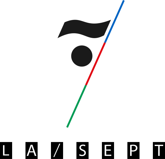
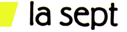
1986–1987 (prelaunch)
| SVG NEEDED |
1987–1992

| SVG NEEDED |
|
|
|
Arte has its origins in La Sept (The Seventh), in which its name itself is a backronym: Société d’Édition de Programmes de Télévision (later Société Européenne de Programmes de Télévision), a French educational and cultural channel. Its graphics were made in 1986 and would start its broadcasting in 1989, initially only via satellite and cable. It gained a wider audience when it was given a window on FR3 as a timeslot on terrestrial television in 1990.
To this day, French TV platforms always carry Arte at channel number 7, despite it not being named after the number (there is no fixed channel number in Germany).
The channel's identity was designed by Étienne Robial and Mathias Ledoux at On/Off Productions. It featured part of a big yellow trapezium with the name "La Sept" written on the side. The identity was accompanied by a musical theme composed by a British composer named Michael Nyman.[1][2][3][4]
Arte
1991 (unused)

1992–1995
| SVG NEEDED |
|
|
|
During the late 1980s, there were talks between German and French governments about creating a Franco-German cultural television channel. Arte was set up during 1990 and 1991. Arte would take over after La Sept in France, while there was no real predecessor in Germany.
Arte was launched on May 30, 1992. In Germany, it was only available on pay-TV providers, but thanks to the bankruptcy of La Cinq, a French commercial channel, Arte was allowed to take over its frequencies and air its programs terrestrially in France, once again as a timeslot between the evening and late night.[5][6]
1995–present
1995–2000
|
|
|
On January 2, 1995, Arte adopted a new identity designed by Martin Lambie-Nairn of his titular design agency in Britain. This is the same basic logo that is used to the present day.
2001–2004

| BETTER LOGO NEEDED |
|
|
|
A new identity was launched on January 1, 2001. At around the same time, Arte stopped being an evening-only service and started airing its programs at 2:00 p.m. EET.
The new identity was commissioned back in February 2000. After five years of artistic abstractions, the new identity told stories that were closer to everyday life. The new identity was designed by Razorfish, an international branding agency.[7][8][9][10][11][12]
2004–2011
2004–2008
|
|
|
Yet another new identity, designed by Velvet Mediendesign, was introduced on January 3, 2004.[13]
- "Arte's new design attaches to the principle of openness. The simplicity of lines translates the readability of the schedule, to which special care has been taken to respect the viewers. The stories, the colors, the music marks a real human warmth. In a general way, the screen reorganisation awakens the curiosity of the viewer. This is to surprise and to capture his attention." —Text from Arte explaining its then-new identity.
In 2005, Arte would now air its programs 24/7 via digital terrestrial television (in French: TNT, for Télévision Numérique Terrestre), as does France 5, which used to occupy a timeslot for the channel on analog television.
2008–2011

|
|
|
Another new identity for Arte made its debut on September 6, 2008. This identity was designed by Luxlotusiner in Munich and Novaprod in France. In its on-screen presentation, the Arte logo would now be usually seen on top of a 'cartridge' with bright color gradients. The tilted logo from 2004 remained unchanged.
")
")
2011–2017; 2011–2026 (secondary)
|
|
|
On February 28, 2011, Arte reverted to its straight, untitled logo and launched a new identity once again, with Gotham being used as its corporate font.[15][16][17]
2017–2026
|
|
|
")

")
On March 28, 2017, Arte rotated its logo counter-clockwise by 90° and launched a new set of graphics using Barna, a stencil font, as its on-screen font. This set of graphics, where the Arte logo acts as a magnet, was designed by Superunion in Britain.[18][19][20]
2026–present
References
- ↑ On/Off Productions
- ↑ On/Off Productions
- ↑ interactv.online.fr
- ↑ INA.fr
- ↑ INA.fr
- ↑ BUF.com
- ↑ ARTE s'habille pour 2001
- ↑ ARTE Magazine (French)
- ↑ Strategies.fr
- ↑ Strategies.fr
- ↑ ARTE annual report 2001 (German)
- ↑ Findarticles
- ↑ *arte "So hab' ich das noch nie gesehen", mit neuer Optik von velvet mediendesign
- ↑ *Luxlotusiner
- ↑ Jean Marc Morandini
- ↑ Le JDD
- ↑ Le Blog TV News
- ↑ Creative Review: The Partners and Lambie-Nairn rebrand TV channel Arte
- ↑ Design Tagebuch: Au revoir Gotham – Neues Design für Arte
- ↑ Superunion
Footnote
1ARTE is a French acronym for Association relative à la télévision européenne.


| ZDF | ZDF Info | ZDF Neo
Block: ZDF Tivi In co-operation
Programs YouTube-channels Other Defunct
1Joint venture with ARD.
|
| French channels:
France 2 | France 3 | France 4 | France 5 | Franceinfo Digital channels: France.tv Docs | France.tv Séries | France.tv Sport | France.tv Roland-Garros France 3 regional networks: French overseas networks (La 1ère): International channels: Blocks: Programs: Newscasts Websites and platforms: Other assets: Defunct/Former: Disbanded:
1Joint venture with ARD and ZDF. |
| Eurovision/Euroradio ARD (Germany) |
ARMR (Armenia) |
ARMTV (Armenia) |
Arte (France / Germany) |
BBC (United Kingdom) |
BHRT (Bosnia and Herzegovina) |
BNR (Bulgaria) |
BNT (Bulgaria) |
C4 (United Kingdom) |
ČRo (Czechia) |
ČT (Czechia) |
CyBC / RIK / RKYK (Cyprus) |
DR (Denmark) |
ENRS (Algeria) |
EPTV (Algeria) |
ERR (Estonia) |
ERSL (Luxembourg) |
ERT (ERA) (Greece) |
ERTU / NTU (Egypt) |
GPB (Georgia) |
FMM (F24 | MCD | RFI) (France) |
France.tv (France) |
HRT (HR) (Croatia) |
İCTI (İR | İTV) (Azerbaijan) |
JRTV (Jordan) |
Kan (IPBC) (Israel) |
LNC (Libya) |
LRT (Lithuania) |
LSM (Latvia) |
MMD (Monaco) |
MRT (North Macedonia) |
MTVA (Duna) (Hungary) |
NPO (Netherlands) |
NRK (Norway) |
NSTU (Ukraine) |
ORF (Austria) |
PBS Ltd. (Malta) |
PR (Poland) |
RAI (Italy) |
Radio France (France) |
ROR (Romania) |
RT (Tunisia) |
RTBF (Belgium) |
RTCG (Montenegro) |
RTÉ (Ireland) |
RTL (Luxembourg) |
RTP (Portugal) |
RTS (Serbia) |
RTSH (Albania) |
RTVA (Andorra) |
RTVE (Spain) |
RTVSLO (Slovenia) |
RÚV (Iceland) |
SMRTV (San Marino) |
SNRT (Morocco) |
SRG SSR (Switzerland) |
SRT (SR | SVT | UR) (Sweden) |
STVR (Slovakia) |
TDA (Algeria) |
TG4 (Ireland) |
TL (Lebanon) |
TRM (Moldova) |
TRT (Turkey) |
TVM (Monaco) |
TT (Tunisia) |
TV 2 (Denmark) |
TV 2 (Norway) |
TVP (Poland) |
TVR (Romania) |
UKIB (ITV | S4C | STV) (United Kingdom) |
VR (Vatican City) |
VRT (Belgium) |
Yle (Finland) |
ZDF (Germany) Associated members Approved members Competitions Awards ceremonies Defunct/cancelled competitions  |