This page only shows primary logo variants. For other related logos and images, see:
|
| 1925–1926 | 1926–present | 1950–1962 | 1953–1962 | 1962–1995 |
| 1967 (unused) | 1973 (unused) | 1995–2020 | 2020–present | |
NHK (abbreviated from 日本放送協会, and officially known as in English: Japan Broadcasting Corporation) is a Japanese public organization which has always been known by its romanized acronym in Japanese since 1950. Founded as "Tokyo Broadcasting Station" on November 29, 1924 and merged with Osaka and Nagoya radio stations into a national broadcasting corporation on August 6, 1926, the NHK is the largest public broadcaster in Asia, and the second only in the world. It is run by the Japanese government and has a funded license fee, modeled after the BBC of the UK, as implemented by the Japanese Broadcasting Act of 1950.
The NHK started their experimental television broadcasting on June 1 of that same year, followed by full-time broadcasts of its public national television service three years later, its educational television service in 1959, and internationally in 1995.
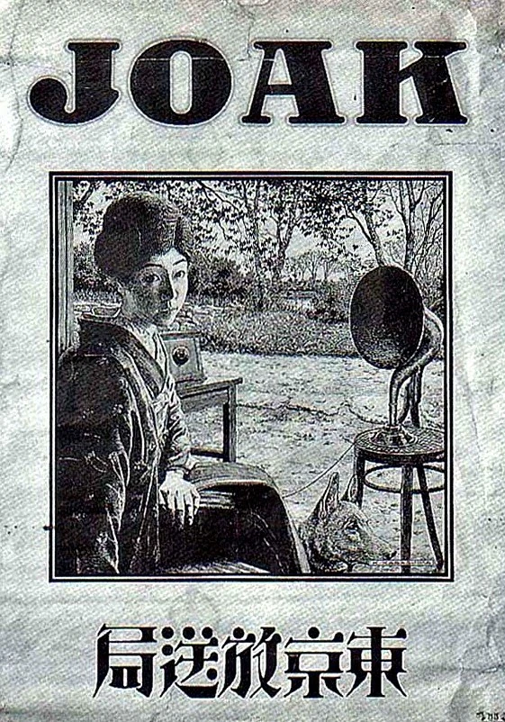
JOAK Radio
1925–1926
| SVG NEEDED |
NHK began as JOAK Radio, now NHK AM in Tokyo on March 22, 1925. The first radio station in Japan, its logo had a callsign on the top, a portrait photo with a woman and a radio speaker in the middle, and the Japanese characters "東京放送局" in reverse order (as was Japanese script before 1946). Later in 1925, radio stations were being opened in Osaka (JOBK) and Nagoya (JOCK).
Broadcasting Corporation of Japan
1926–present

The three stations in Tokyo, Osaka and Nagoya merged together as what is now NHK in August 1926. The following year, the network established stations in Sapporo, Sendai, Hiroshima and Kumamoto. Its official English name before and during World War II was the Broadcasting Corporation of Japan. The emblem still used as the emblem of the NHK but very rarely.
NHK
1950–1962

The use of the "NHK" abbreviation dates back to 1939 in a draft agreement for cultural exchange between Japan and Italy, but it did not become official until 1950. During the American occupation of Japan, the Civil Information and Education Section (CIE) of the Supreme Commander for the Allied Powers discussed with Japanese staff of NHK. The CIE determined that if private broadcasting was to be established in Japan in the future, listeners would need to be able to identify the broadcasting station with a three-letter acronym inspired from "the big three" of American broadcasters and the BBC.
The CIE suggested the abbreviations "BCJ" or "JBC" (Broadcasting Corporation of Japan/Japan Broadcasting Corporation), but the NHK rejected them because rounded characters without corners would be difficult to read and pronounce in Japanese. On 3 March 1950, the "NHK" abbreviation was proposed as an easily pronounceable and writable acronym, becoming widely accepted. On 6 July of the same year, the NHK trademark was registered.
NHK did not have a proper logo until 1953 and simply used the letters "NHK" in a simple sans-serif font. Even with the introduction of the logo, a simple wordmark continued to be used more widely, appearing in a variety of styles until it was standardized into a logo in May 1962.
1953–1962
 |
This logo was introduced with the start of television broadcasts in February 1953, but it was rarely used and mostly appeared in QSL cards and on the first test pattern used on JOAK-TV in 1953. It was used along with the more widespread wordmark until the wordmark was italicized and standardized in May 1962.
1962–1995

|
|
|
1967 (unused)

|
|
|
Designed by Yusaku Kamekura in 1967, this unused logo played on the negative space between letters in the same vein as Metromedia at the time.
1973 (unused)

|
|
|
This logo was designed to hearken the advents of both color television and satellite broadcasting in Japan. The circular pattern evokes not only the phosphor dots of color television screens but of Japanese mon symbols. It was designed simply enough to be represented by any variety of circular objects on a given program. The symbol was registered as a trademark but was not introduced due to negative press surrounding the high construction cost of the NHK Broadcasting Center.
1995–2020
|
|
|
This logo, known as "The NHK Eggs", was used for 25 years, starting on March 22, 1995, commemorating the 70th anniversary of Tokyo Broadcasting Station. It has three gathered eggs, each one having a letter. It has two variants: one with a rainbow gradient outline, and one with a gray outline.
2020–present
|
|
|
On March 30, 2020, the NHK removed the iconic eggs logo in favor of a modified version of the wordmark. All their channels and radio stations had their logos updated to include the new wordmark.
External links
NHK
|
|---|
| Television Terrestrial NHK General TV Radio NHK World-Japan News programs Programs Online/digital platforms NHK Cosmomedia America Websites Divisions Other Defunct |
| Full members ABC (Australia) | ANT (RTA) (Afghanistan) | BB (Bangladesh) | BBS (Bhutan) | BPA (Kiribati) | BTV (Bangladesh) | CMG (CCTV | CGTN | CNR | CRI) (China) | ERTU (Egypt) | FTV (Fiji) | IBC (Philippines) | IRIB (Iran) | İTV (Azerbaijan) | JRTV (Jordan) | KBS (South Korea) | Khabar Agency (KA) (Kazakhstan) | KRT (North Korea) | KTRK (Kyrgyzstan) | LNR (Laos) | LNTV (Laos) | MBC (South Korea) | Mediacorp (Singapore) | MNB (Mongolia) | MNL (Papua New Guinea) | MRTV (Myanmar) | MTRK (Uzbekistan) | NBC/PNG (Papua New Guinea) | PRD (NBT | Radio Thailand) (Thailand) | NHK (Japan) | NRTA (China) | NTV (Nepal) | PBC (Pakistan) | Prasar Bharati (DD | AIR) (India) | PSM (Maldives) | PTNI/PTV (Philippines) | PTV (Pakistan) | QMC (Qatar) | RNE (Nepal) | RNZ (New Zealand) | RRI (Indonesia) | RTB (Brunei) | RTM (Malaysia) | RTTL (East Timor) | SBA / SAR (Saudi Arabia) | SBC (Samoa) | SLBC (Sri Lanka) | SLRC (Sri Lanka) | TBC (Tonga) | TBS (Japan) | TPT (Thailand) | TRT (Turkey) | TV Turkmenistan (Turkmenistan) | TV5 (Mongolia) | TVK/RNK (Cambodia) | TVNZ (New Zealand) | TVRI (Indonesia) | UTRK (Kyrgyzstan) | VBTC (Vanuatu) | VOV (Vietnam) | VTV (Vietnam) Additional full members Associate members Affiliated members Institutional members Former members Competitions  |
| Eurovision/Euroradio ARD (Germany) |
ARMR (Armenia) |
ARMTV (Armenia) |
Arte (France / Germany) |
BBC (United Kingdom) |
BHRT (Bosnia and Herzegovina) |
BNR (Bulgaria) |
BNT (Bulgaria) |
C4 (United Kingdom) |
ČRo (Czechia) |
ČT (Czechia) |
CyBC / RIK / RKYK (Cyprus) |
DR (Denmark) |
ENRS (Algeria) |
EPTV (Algeria) |
ERR (Estonia) |
ERSL (Luxembourg) |
ERT (ERA) (Greece) |
ERTU / NTU (Egypt) |
GPB (Georgia) |
FMM (F24 | MCD | RFI) (France) |
France.tv (France) |
HRT (HR) (Croatia) |
İCTI (İR | İTV) (Azerbaijan) |
JRTV (Jordan) |
Kan (IPBC) (Israel) |
LNC (Libya) |
LRT (Lithuania) |
LSM (Latvia) |
MMD (Monaco) |
MRT (North Macedonia) |
MTVA (Duna) (Hungary) |
NPO (Netherlands) |
NRK (Norway) |
NSTU (Ukraine) |
ORF (Austria) |
PBS Ltd. (Malta) |
PR (Poland) |
RAI (Italy) |
Radio France (France) |
ROR (Romania) |
RT (Tunisia) |
RTBF (Belgium) |
RTCG (Montenegro) |
RTÉ (Ireland) |
RTL (Luxembourg) |
RTP (Portugal) |
RTS (Serbia) |
RTSH (Albania) |
RTVA (Andorra) |
RTVE (Spain) |
RTVSLO (Slovenia) |
RÚV (Iceland) |
SMRTV (San Marino) |
SNRT (Morocco) |
SRG SSR (Switzerland) |
SRT (SR | SVT | UR) (Sweden) |
STVR (Slovakia) |
TDA (Algeria) |
TG4 (Ireland) |
TL (Lebanon) |
TRM (Moldova) |
TRT (Turkey) |
TVM (Monaco) |
TT (Tunisia) |
TV 2 (Denmark) |
TV 2 (Norway) |
TVP (Poland) |
TVR (Romania) |
UKIB (ITV | S4C | STV) (United Kingdom) |
VR (Vatican City) |
VRT (Belgium) |
Yle (Finland) |
ZDF (Germany) Associated members Approved members Competitions Awards ceremonies Defunct/cancelled competitions  |