RAI - Radiotelevisione italiana, abbreviated and stylized publicly as Rai, is the national public broadcaster of Italy. It was founded in 1924 as the Unione Radiofonica Italiana (URI), as Italy's first public radio broadcaster. During the Fascist era, The body was replaced by the Ente Italiano per le Audizioni Radiofoniche (EIAR) in 1927, then, in 1944, by Radio Audizioni Italiane (RAI) as it was known until they started their television broadcasts in 1954. Rai operates more television channels at the national level than any other European public broadcaster.
Unione Radiofonica Italiana (URI)
1924–1927
NO KNOWN LOGO
During this time, URI was only mentioned by name, and therefore had no logo.
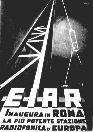
Ente Italiano per le Audizioni Radiofoniche (EIAR)
1927–1944
BETTER LOGO NEEDED
With the Royal Decree No. 2207 of November 17, 1927, URI became the Ente Italiano per le Audizioni Radiofoniche (EIAR). The new company was granted an exclusive concession for broadcasting for the following 25 years.
RAI (Radio Audizioni Italiane (1944-1954), Radiotelevisione Italiana (1954-present))
1944–1949
NO KNOWN LOGO
In October 1944, towards the end of World War II, EIAR was replaced with Radio Audizioni Italiane (RAI).
With the start of television broadcasts in Italy, Rai changed its full name to Radiotelevisione Italiana.
1970–1982
Designer:
Alberto Ribera
Typography:
Futura Black WGL4
Launched:
Unknown
1982–1988
Designer:
Studio ARA
Typography:
Custom
Launched:
Unknown
This logo was still used on the front signage of the RAI building of Via Teulada, Rome until at least 2018.
1988–2000
Designer:
Giorgio Macchi
Typography:
Custom
Launched:
September 26, 1988
This modified version of the 1982 logo, which detaches the RAI letters, has been used on International Transmissions beyond the year 2000. It was also used on the RaiSat logo and its channels from 1997 to 2010. It was still used as part of the sign-on and sign-off sequence up until September 23, 2012. It's still used, in in plain white, on the RAI "Saxa Rubra" radio-TV production center.
March 16, 2000 (soft-launch) October 23, 2000 (official)
This logo was adopted on October 23, 2000. The logo is graphically illustrated by two heads face to face, representing the idea of dialogue and interactivity. The two profiles form the shape of a butterfly to give a perception of weightlessness.
RAI's corporate name was also styled as "Rai" (the company's name is normally pronounced as R-a-ee instead of R-A-I) for the first time, and ever since then, it has been remained that way. The logo was launched as part of a new brand architecture which repositioned all of Rai's companies, all of their TV channels, and all of their radio stations, in a monolithic model used to bring them under a master brand.
Although the new logo was adopted in 2000, the old one would remain in use in many places up until 2010. The RaiSat channels never adopted the new logo, and it also remained in animation shown at the end of the broadcast day. This is also the first Rai logo to have the new Futura font.
2010–present
2010–2016
Designer:
Frame by Frame
Typography:
Futura
Launched:
May 18, 2010
On May 18, 2010, Rai launched a new brand platform, based on the name of the company inside a square. The design was based around the logos of Rai's digital-only channels at that time, specifically Rai 4, Rai Storia, Rai Scuola, Rai Gulp, and Rai Sport 1. The rebranding coincided with the switchoff of all of Italy's analog TV broadcasting signals, and ditching them up entirely in favor of the new digital TV system adopted by the country.
The "butterfly" symbol would remain in a transition period, with the letters occasionally fading into the old symbol on screen. All of the channels (including the channels under the former RaiSat brand) adopted this logo system. The on-screen bugs of their TV channels moved from the traditional bottom right corner of the screen (which is still used by Mediaset and La7) to the top right corner.
This set of graphics, alongside the sets they implemented for all of its channels, was designed by Frame by Frame.
Futura (Rai's logotype) Lubalin Graph Bold BT (name joined to Rai's logo) Neue Haas Grotesk (on air graphics and corporate identity)
Launched:
September 12, 2016
On September 12, 2016, Rai and all of its brands redesigned its logo and launched a new brand identity. The new design still maintains Rai's corporate logo. with its iconic blue color, but in a darker shade. The Rai logo itself continues to be set in the classic Futura font, but all of its sub-brand logos now use the Lubalin Graph BT font instead of Futura, while their on-air identities now use Neue Haas Grotesk.
The original concepts and the new more recent graphics for it are designed by Rai's in-house team, the initial rebranding of the four largest TV channels, specifically Rai 1, Rai 2, Rai 3 and Rai 4, were all done by Eloisa (the two-dimensional and original versions), a Uruguayan design agency, and then Flopicco (three-dimensional idents and the rest of the channels), an Italian design agency, and, more recently, Alkanoids (more three-dimensional idents, until 2021 circa).
Participating Members Al Manar / Al Nour (Lebanon) |
Al-Watan (Kuwait) |
beIN (Qatar) |
MEBC (Middle East) |
OSN (Middle East) |
Rotana Media Group (Saudi Arabia)
Associated members Addounia TV (Syria) |
Alhurra (United States) |
CFI (France) |
F24 (France) |
Hannibal TV (Tunisia) |
Nessma TV (Tunisia) |
PTV (Pakistan) |
RNW (Netherland) |
Rai (Italy) |
RT (Russia) |
RTVE (Spain) |
Sky News Arabia (United Arab Emirates) |
Zayed Radio for Holy Quran (United Arab Emirates)