This article is about the American television network. For its former parent, see CBS Corporation . For the radio network, see CBS Radio .
This page only shows primary logo variants.
For other related logos and images, see:
CBS Broadcasting Inc. , commonly shortened to CBS , the abbreviation of its former legal name Columbia Broadcasting System , is an American commercial broadcast television and radio network serving as the flagship property of the CBS Entertainment Group division of Paramount Skydance .
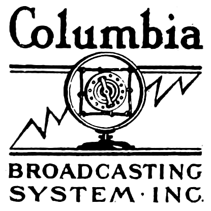
Columbia Broadcasting System, Inc. 1927-1931
SVG NEEDED
Launched: September 18, 1927
CBS 1931-1935 1935–1937 1937–1941 1941–1951
Designer: William Lescaze
Launched: September 8, 1941
Although replaced in 1951, this would still be used by CBS News until 1965.
1946–1951 The CBS television network's initial logo, used between 1946 and 1951, consisted of an oval spotlight which shined on the block letters "C-B-S".
1951–present
Designer: Kurt Weihs (designer) (art director)
Launched: October 20, 1951
The present-day Eye device was conceived by William Golden, based on a Pennsylvania Dutch hex sign as well as a Shaker drawing. The Eye device made its broadcast debut on October 20, 1951. The following season, as Golden prepared a new ID, then-CBS president Frank Stanton insisted on keeping the Eye device and using it as much as possible. The logo is alternately known as the "Eyemark", which was also the name of CBS's domestic and international syndication division in the mid-to-late 1990s before the King World acquisition and Viacom merge.
1966–2021
Designer: Lou Dorfsman,(CBS Didot) [ 1]
Didot came into use as CBS' corporate font in 1952. Freeman Craw designed the CBS Didot font in 1966.
Until 2020, this was still being used as a corporate logo. In 2020, this logo began to be transitioned away from, but CBS Television Distribution kept on using this logo until it became CBS Media Ventures . CBS News ' and CBSN 's Didot logos were still used on their website until November 2022, despite their logos being changed in October 2020 and January 2022, respectively. It's continued be used for the signage at the CBS Broadcast Center and Television City , as well as CBS EYE Productions .
CBS used Didot on-screen in its "In Color" ident from 1966–1970, in the network IDs of four seasons from 1985–1989, and for its "Welcome Home" idents from 1996–1998.
2020–present
Designer: Gretel (brand) (sonic branding)
Typography: TT Norms Pro (logo; on-air)
Launched: October 8, 2020[ 2]
In October 2020, CBS changed its wordmark (along with the brand's Didot font) to TT Norms Pro. The new brand was done by New York-based Gretel. A five-note audio logo, set to the cadence of the phrase "This is CBS," was done by Antfood. CBS News , CBS Television Stations (now CBS News and Stations ), CBS Audio and CBS Sports also updated their wordmarks; CBS Television Studios' name was changed to simply CBS Studios ; CBS Television Distribution was renamed to CBS Media Ventures ; and CBS Television City became simply Television City (due to divesting itself away from the network). The new wordmark is relatively similar to the 2015 one.
References External links
Predecessors: National Amusements Paramount Skydance Media (CBS Enterprises | CBS Inc. | Famous Players Film Company | Gulf and Western Industries | Jesse L. Lasky Feature Play Company | Paramount Communications | Paramount Famous Lasky Corporation | Viacom International | CBS Corporation (original) | Viacom | CBS Corporation )
Streaming Paramount+ (Original | Exclusive ) | 10 | BET+ | CBS Sports HQ | CBS Sports Golazo Network | CBS News 24/7 | ET | 5 | Pluto TV (Nordics 24 SkyShowtime 23
TV Media US television networks: CBS Entertainment Group CBS (Sports (Network ) ) | Dabl 7 | Start TV 7 | The CW (Plus | Sports )6
CBS News and Stations :Main assets: CBS News (CBS Audio )CBS O&O: KCBS-TV | KCNC-TV | KDKA-TV | KOVR | KPIX-TV | KTVT | KYW-TV | WBBM-TV | WBZ-TV | WCBS-TV | WCCO-TV /KCCW-TV | WFOR-TV | WJZ-TV | WUPA | WWJ-TV CW affiliates:WBFS-TV | WKBD-TV Independent stations: KCAL-TV | KMAX-TV | KPYX | KSTW | KTXA | WLNY-TV | WPKD-TV | WPSG | WSBK-TV | WTOG Start TV affiliate:WBXI-CD
Paramount Media Networks 45 :MTV Entertainment Group MTV (2 | U | Live | Classic ) | Comedy Central | CMT (Music ) | Logo | Paramount Network | Pop | Smithsonian Channel | Trés | TV Land | VH1
Nickelodeon Networks Nickelodeon (Nick at Nite | Preschool Block ) | Nick Jr. | Nicktoons | TeenNick | NickMusic | NickOnBoard (cruise lines only)
BET Media Group BET | Gospel | Her | Hip-Hop | Jams | Soul
Showtime Networks Paramount+ with Showtime (Showtime 2 | Showcase | Extreme | Family Zone | Next | Women | SHO×BET ) | The Movie Channel (Xtra ) | Flix
Production and distribution CBS Studios (BET Studios | Nickelodeon Productions (Latin America ) | Nickelodeon Animation Studio (Nick Digital | Avatar Studios ) ) | CBS Broadcasting | CBS EYE Productions | CBS Media Ventures | Big Ticket Television | CBS Media Ventures | Paramount Television International Studios | See It Now Studios | TV Land Original Productions | Paramount Television International Studios (United Kingdom | Americas (TIS )) | The CW Original 6 | South Park Digital Studios (50%)
Internet properties: 247Sports | AwesomenessTV | CBSSports.com | MaxPreps | MTV.com | MySimon | Nick.com | NickJr.com | Scout.com | SportsLine | Skydance Interactive | Skydance New Media
Cinema chains Showcase Cinemas (United Kingdom | Argentina ) (Cinema de Lux ) · Multiplex | UCI (Brazil) (UCI Kinoplex 39 | UCI Orient 40 )
Other assets: Ananey Communications | CBS Audio | CBS News | Comedy Central Records | Milkshake! | Nickelodeon Records 41 | Nickelodeon Slime | Paramount Audio | Paramount Consumer Products | Paramount Dolby Cinema | Paramount Games Studio | Paramount Global Content Distribution | Paramount Music | Paramount Veterans Network | Paws, Inc. | Velocity | ViacomCBS Digital Studios | EyeQ | Paramount Vantage (platform) | Skydance Sports | Premium Large Format
Divested: Addicting Games | AXS TV (HDNet Movies ) (20%) | Bellator MMA | Blockbuster Entertainment (Blockbuster | DEJ Productions | Game Rush | Xtra-Vision ) | BradyGames | CBS Eye on People | CBS/Fox Video 5 | CBS Musical Instruments (Fender | Gemeinhardt | Gulbransen | Lyon & Healy | Rhodes | Rodgers | Rogers Drums | Steinway & Sons ) | CBS Outdoor | CBS Radio | CBS Records International | CBS Telenoticias | CNET | Cheddar U | Chilevisión 44 | Chowhound | Clicker | Columbia Records 28 | Comic Vine | DreamWorks Animation 3 | DreamWorks Pictures 29 | DreamWorks Television 29 | Epix | Esquire | Famous Music Group (Blue Thumb Records | Dot Records | Paramount Records ) | Famous Players (SilverCity | Paramount Theatre | Colossus | Coliseum ) | Fox Hills Video | GameFAQs | GameSpot | GameTrailers | Giant Bomb | Grupo Telefe 43 (Telefe (Buenos Aires | Rosario | Santa Fe | Córdoba ) ) Harmonix | Heron Communications | Heron Home Entertainment | Hi-Tops Video | Ideal Toy Company | KinoStar (Russia) | Last.fm | Lifetime 4 | Lifetime Entertainment Services 4 | Madison Square Garden | Media Home Entertainment | Metacritic | MetroLyrics | MGM/CBS Home Video 20 | Midwest Sports Channel | Miss Universe | MSG Network | MTV (Greece | Taiwan ) | MTV8 | Neopets | New York Knicks | New York Rangers | New York Yankees | Nickelodeon en Telemundo 3 | The Nostalgia Merchant | Orion Pictures | Paramount Parks (Bonfante Gardens | Canada's Wonderland | Carowinds | Great America | Kings Dominion | Kings Island | Star Trek: The Experience ) | Porta dos Fundos | Prentice Hall | Rainbow S.p.A. (30%) (Bardel Entertainment | Colorado Film | Rainbow CGI | Tridimensional | Witty Toys ) | Rede Telecine | RTL CBS Asia Entertainment Network 21 (RTL CBS Entertainment | RTL CBS Extreme ) | SBS MTV 8 | Sega 50 | Shockwave | Simmons Bedding | Simon & Schuster 48 (Pocket Books ) | Stax Records | Sundance Channel 49 | TechRepublic | TeleUno | TriStar Pictures 28 | TV Guide | TV Land (Canada) | TV.com | United Paramount Theatres | UrbanBaby | USA Network 3 (Sci-Fi Channel ) | Viacom18 2 | VidCon | Virgin Interactive Entertainment | Xfire | ZDNet
Defunct: ABC Films 22 | All News Channel 17 | Artcraft Pictures | BET (Africa | France ) | BET Home Entertainment | BET Event Productions | Blockbuster Music | BNET | The Box (United States) | Cable Health Network | CBBC on Nickelodeon 13 | CBS All Access | CBS Broadcast International | CBS Enterprises | CBS Films | CBS/Fox Children's Video 5 | CBSN Originals | CBS News Radio | CBS Paramount Network Television | CBS Paramount Television | CBS Productions | CBS Studios International | CBS Records | CBS Theatrical Films | CBS Video | CIC Video 1 | CMT Films | Camelot Entertainment Sales | Cinema Center Films | Cinema International Corporation | Comedy Central (Asia | Australia & New Zealand | Austria | Balkans (Extra ) | CIS | Czechia 47 | Hungary (Family ) | India | Israel | Netherlands (Extra | Family ) | Switzerland | Ukraine 10 ) | Comedy Central Games | Comedy Central Films | Comedy Central Productions | The Comedy Channel Originals | Commonwealth United Entertainment | CW Seed | Defy Media | Desilu Productions | Eyemark Entertainment | Famous Studios | Fave TV | Film Cafe 12 | Fox-Paramount Home Entertainment 5 | Game One (Music HD ) | GameRankings | GlobalCaptions.com | Group W Network Services | Group W Productions | Ha! TV Comedy Network Originals | Home Theater Network | The Indie-Verse | Insurge Pictures | InterStar Releasing 19 | J-One | Key Video 5 | Kindernet | King World Productions (King World Direct ) | Laurel Entertainment | Liberty Films | MásMúsica TeVe | Mirage Studios | Mon Nickelodeon Junior | MTV (80s | 90s | 00s | Club | Hits | Live | Music 24 • Adria | Africa (Base ) | Asia | Austria | Australia (Classic | Club | Hits | Live | Music ) | Baltic (Estonia | Latvia | Lithuania & Latvia ) | Belenux (Brand New | Hits ) | Brazil (Brasil 15 ) | Canada (2 ) | China (Mandarin ) | Czechia & Slovakia 46 | France (Base | Hits | Idol | Live HD | Pulse ) | Germany (+ | 2 Pop | Brand New | Entertainment | Hits | Music ) | Hungary | Ireland (Music ) | India (Beats ) | Italy (Brand New | Classic | Hits | Music | Next | Pulse ) | Indonesia | Israel | Japan (Hits | Mix ) | Latin America (Hits ) | Middle East | New Zealand (Classic | Hits | Music ) | Nordic (Denmark | Finland | Norway | Sweden ) | Pakistan (owned by third-party company; licensed by Paramount) | Philippines (MTVph 18 | Pinoy 16 ) | Poland (Classic | Music ) | Portugal | Romania | Russia | Switzerland | Turkey | Vietnam | Ukraine | UK & Ireland (80s | 90s | Club | Extra | Flux | Hits | Live | Music | OMG | Rocks | Shows ) | United States (Chi | Desi | Español | K | X ) ) | MTV Animation | MTV Entertainment Studios | MTV Films (Europe ) | MTV Games | MTV Mobile (Germany 33 | Italy 34 | Netherlands 35 | Poland 36 | Romania 37 | Switzerland 38 ) | MTV News | MTV Original TV Movies | MTV Teen | My MTV (Music ) | Mascot Pictures | Miramax/Dimension Films | Miramax Books | Miramax International | Miramax Home Entertainment | Miramax/Dimension Home Entertainment | Miramax Family Films | MountainWest Sports Network | The N | The N Originals | NBC Films 3 | NTA Home Entertainment | National Telefilm Associates 5 | Nickelodeon (Australasia (Nick Jr. ) | Austria | China | Estonia | France (N-Toons ) | GAS (Nick Nach Acht | NickNight ) | Global (NickMusic ) | Greece (+ | Nick Jr. | TeenNick ) | Hungary (TeenNick ) | India (TeenNick ) | Italy (TeenNick ) | Japan | Latin America and the Caribbean (2 | Nick at Nite | Nick Hits | Nicktoons | TeenNick ) | Middle East | New Zealand | Pakistan 27 | Romania (TeenNick ) | Russia/CIS (Nick Jr. | Nicktoons ) | South Korea 8 | Ukraine (Nick Jr. | Nicktoons ) 10 | UK & Ireland (Nick at Nite | TeenNick ) | United States (2 | NickGames | Nick GaS | NickMom ) | Vietnam (Nick & You ) ) | Nickelodeon Games | Nickelodeon Studios | Nickelodeon Video 2 39 | Nick at Nite Originals | Nick DVD (Nick Jr. DVD ) | Nick Jr. Games | Nick Jr. Productions | Nick Radio | NickRewind (NickSplat on VRV ) | NickSports | Nicktoons Originals | Noggin | Noggin Original | One World Entertainment | onGamers | Oxford Films | ParaFrance | Paramount Cartoon Studios | Paramount Comedy (Russia) | Paramount Comics 14 | Paramount Digital Entertainment | Paramount Domestic Television | Paramount DVD | Paramount Famous Productions | Paramount High Definition | Paramount Channel/Paramount Network (Asia | Brazil | Czechia | Denmark | Finland | France | Hungary (Karácsony 26 ) | Italy | Latin America and the Caribbean | Romania | Russia/CIS | Spain | Sweden | Ukraine 10 ) | Paramount Network Originals | Paramount Network Television | Paramount News | Paramount Play | Paramount Stations Group | Paramount Televsion | Paramount Television Network | Paramount Television Productions | Paramount Television Service | Paramount Toys 14 | Paramount Vantage | Peanuts Home Video 41 | Playhouse Video 5 | Prism Pictures | QM Productions | Republic Pictures Home Video | Republic Pictures Television | RTL Spike 11 | RTV News Inc. | Satellite News Channel 22 | Skydance Television | Spelling Entertainment Group Inc. | Spelling Films | Spelling Television | Spike (Australia | Italy | Russia | Ukraine ) | Sunn Classic Pictures | Taft Entertainment Pictures 45 | Taft Entertainment Television 45 | Taft, H-B Program Sales 45 | TeenNick Originals | Thomas-Spelling Productions | TMF Dance | TMF Flanders | TMF NL | TMF Pure | Torand Productions | Trés Jr. | U.M. & M. TV Corporation | UPN | VIVA (Austria | Germany | Hungary | Poland | Switzerland | United Kingdom ) | VH1 (Adria | Denmark | India | Indonesia | Italy | Latin America (HD ) | Poland | Romania | Russia | UK | Pakistan ) | VH1 Classic (Europe ) | VH1 Films | VH1 MegaHits | VH1 Uno | Viacom (Special Delivery ) | Viacom Blink! | Viacom Consumer Products | Viacom New Media | Viacom Pictures | VistaVision | Voot | Westinghouse Broadcasting Company | Westinghouse Broadcasting International | Wilshire Court Productions | Worldvision Enterprises 22 45 | Worldvision Home Video
Notes
1 Joint venture with BeIN Media Group .
2 Co-owned with TV18 .
3 Co-owned with NBCUniversal (Comcast ).
4 Owned by A+E Global Media , a joint venture of Hearst Communications and The Walt Disney Company .
5 Co-owned with 20th Century Fox .
6 Co-owned with Nexstar Media Group (75%) and Warner Bros. Discovery (12.5%).
7 Joint-venture with Weigel Broadcasting .
8 Co-owned with Seoul Broadcasting System .
9 Co-owned with Corus Entertainment .
10 Co-owned with 1+1 Media .
11 Co-owned with RTL Group (Bertelsmann ).
12 Joint venture with AMC Networks International .
13 Joint venture with BBC .
14 Joint venture with Marvel Comics (The Walt Disney Company ).
15 Co-owned with Grupo Abril from 1990 to 2009.
16 Co-owned with Viva Entertainment .
17 Joint venture with Hubbard Broadcasting .
18 Co-owned with Solar Entertainment .
19 51% owned by Westinghouse Broadcasting .
20 Co-owned with Metro-Goldwyn-Mayer (Amazon ).
21 Joint venture with RTL Group from 2013 to 2018, now owned by Rock Networks since 2021.
22 Co-owned with ABC .
23 Joint venture with Comcast .
24 Co-owned with Viaplay Group .
25 Co-owned with CH Media .
26 Co-owned with Vodafone & UPC .
27 Owned by ARY Digital Network , but licensed by Paramount.
28 Owned by Sony Pictures Entertainment .
29 Owned by Amblin Partners .
30 Joint venture with Grupa Polsat Plus .
31 Joint venture with Sky Group (25%).
32 Co-owned with Blue Ant Media .
33 Operated by E-Plus , but under license from Viacom International Media Networks .
34 Operated by TIM , but under license from Viacom International Media Networks .
35 Operated by T-Mobile /KPN , but under license from VIMN .
36 Operated by T-Mobile , but under license from Viacom International Media Networks .
37 Operated by Telekom Romania Mobile Communications , but under license from Viacom International Media Networks .
38 Operated by Sunrise , but under license from Viacom International Media Networks .
39 Joint-venture with Kinoplex .
40 Joint-venture with Orient Cinemas .
41 Co-owned with Sony Music Entertainment .
42 Owned by Viacom18 , but licensed by Paramount Skydance.
43 Sold to Grupo Televisión Litoral .
44 Sold to Vytal Group .
45 Joint venture with Warner Bros. Discovery .
46 Owned by CME Group , but licensed by Viacom International Media Networks .
47 Joint venture with FTV Prima .
48 Sold to Kohlberg Kravis Roberts .
49 Sold to AMC Networks .
50 Now owned by Sega Sammy Holdings .