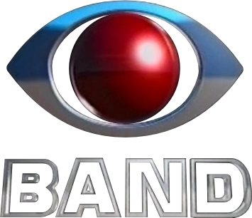
Band uses an eye as its logo, similar to domestic competitor Globo, as well as CBS in the United States.
Rede/TV Bandeirantes
1967–1981 (primary), 1967–1989 (secondary)
Logo with “Rede Bandeirantes” wordmark
Logo with “Bandeirantes” wordmark
1981–1982
Designer:
Unknown
Typography:
Motter Tektura
Launched:
Unknown
Logo with “Bandeirantes” wordmark
Logo with “Rede Bandeirantes” wordmark
1982–1989
Logo with wordmark
1989–present
1989–1990
In 1989, Rede Bandeirantes introduced a new design to their logo that has remained in use ever since. The logo shares a similar design to the CBS logo. The first version of the eye logo, consisted of three colored layers: Black, White and Red, reffering to the flag of the state of São Paulo, the home of the network.
In the following year, the logo suffered some tweaks: the former white area became an empty space, the black one is now silver, and the red circle is presented as a sphere. During a brief period around this time, the name was shortened to "Ban", but it failed to catch on.
1993–1994
Band
In 1993, there was another attempt to shorten the name, this time to "Band", as its director made to its radio counterpart. However, unlike "Ban", it was successful.
1994
1994–1995
In November 1994, Band made the decision to not use the eye logo for a short time, and instead use a wordmark in Eurostile.
1995–1996
1996–1997
1996
1997
1997–2002
1997–1999
1999–2002
2002–2018
Designer:
Unknown
Typography:
Unknown
Launched:
January 20, 2002
Logo with wordmark (2002–2008)
On January 20, 2002, to coincide with their broadcasts of both the Olympic Winter Games Salt Lake 2002 and the 2002 FIFA World Cup respectively, the eye logo colors were changed, replacing the red and silver colors with green and yellow - two of the Brazilian flag colors -, respectively.
2007–2010
Logo with watermark
2010–2018; 2018–2022 (secondary)
Designer:
None
Typography:
None
Launched:
May 2010
The logo got more glossier and shinier - with a texture resembling the TV Globo logo from 2008. From this change, the logo's circle is no longer an sphere and now is represented by a concave disc on the on-air look. The logo is still used on reporters' equipment (eg microphones). The Band logo was used in the Troféu Imprensa 2026 ident.
Logo with wordmark (2010-2011)
Logo with wordmark (2011-2018)
2018–2022
Designer:
None
Typography:
None
Launched:
July 2018
In 2018, Band dropped the Brazilian flag colors, being replaced by a silver color.
Logo with wordmark
2022-present
Designer:
None
Typography:
None
Launched:
2022
In 2022, A slight modification to the Silver set was done in the main logo. The wordmark variant also got a revamp, by going back into using a straightened out typeface over the italic styling.
Other business:
Newspapers: Metro Jornal5 | Primeiramão
Media distribuition: Band Content Distribution
Out-of-home-media: Otima | Outernet (Mão Dupla | Modern Airport | Nextmídia | Orla TV | TV Minuto | TVO)
Digital media: Band.com.br | Band Rádios (Band Music | Ipanema FM | Nativa Country)
Parent companies of affiliated stations: Ecoacre Comunicações | Sistema Integração de Comunicação | Organizações José Alcolumbre | Ministério Verdade | Prefeitura Municipal de Oiapoque | Grupo Rondovisão | Central Rondoniense de Comunicação | Grupo Norte de Comunicação | Grupo RBA de Comunicação | Grupo RTP Castanhal | Prefeitura Municipal de Cametá | Rádio e TV Cidade Comunicação | Grupo Ita de Comunicação | Prefeitura Municipal de Bragança | Grupo Arauto | Prefeitura Municipal de Canaã dos Carajás | Sistema de Comunicação Frederico Braun | Organizações Nivaldo Pereira | M V L Communicare Telecomunicações | Rádio e TV Imprensa | Sistema Sentinela de Comunicação | Rede de Comunicação Regional | Rádio e TV Vale do Uruará | Sistema Floresta de Comunicação | Prefeitura Municipal de Mocajuba | Grupo Sol de Comunicação | Grupo Jade de Comunicação | Via Brasil Comunicação | Macarena Telecomunicações | Rede Metropolitana de Rádio e Televisão | Sistema Veneza de Comunicação | Empresa de Comunicações do Vale do Itapecuru | TV Mearim (company) | Grupo Princesa da Baixada | Prefeitura Municipal de Barra do Corda | Grupo Waldir Jorge de Comunicação | Rádio e TV Santa Helena | Sistema Nova Era de Comunicação | Prefeitura Municipal de São Mateus | Rede Tribuna | TV Vitória Régia (company) | TV Cidade Verde (company) | Grupo Torres de Comunicação | Fundação Internacional de Comunicação | Sistema Clube de Comunicação | Grupo Thathi | Grupo JMalucelli | Grupo Tarobá | Grupo Barriga Verde
Owned-and-operated station in Bold
Main stations in italic 1Owned by Prefeitura Municipal de Bragança 2Owned by Grupo RTP Castanhal 3Owned by Prefeitura de Canaã dos Carajás 4Non owned-and-operated station 5Unknow owner station 6Co-owned with Grupo JMalucelli (55%) 7currently a Rede Amazônica station 8currently a RPC station 9currently a NSC TV station
1Produced independently by Igreja Internacional da Graça de Deus 2Co-produced by Eyeworks-Cuatro Cabezas 3Produced by Comunicação Alternativa 4Co-produced by RTP 5Now on TV Globo

")


")


")
