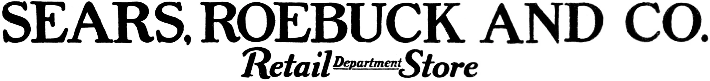
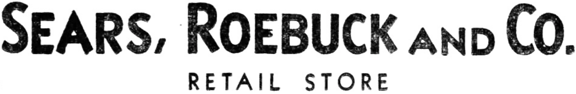
Chicago-based catalogue retailer Sears, Roebuck and Co. opened its first retail outlet near its headquarters in 1925.
1926–1928
SVG NEEDED
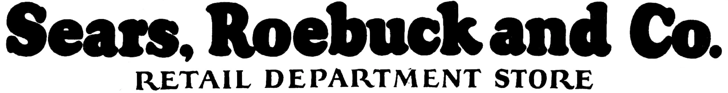
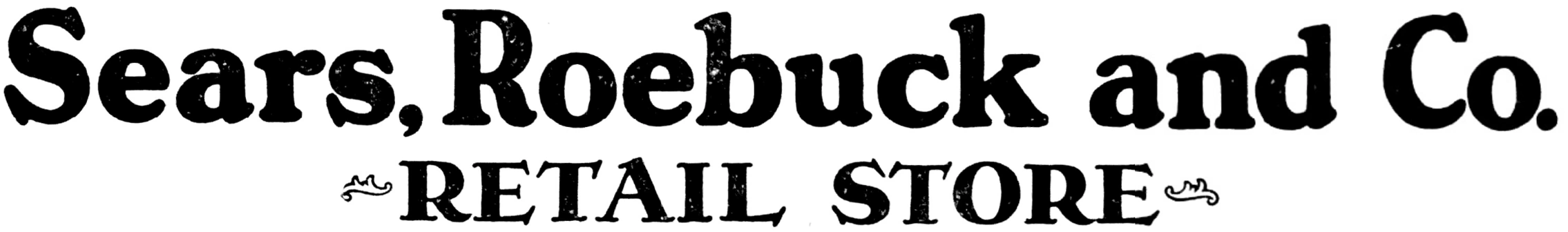
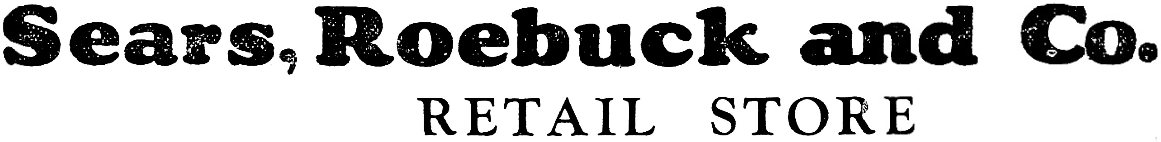
Sears, Roebuck and Co. Retail Store
1928–1929
SVG NEEDED
March–December 1929
SVG NEEDED
1929–1930
SVG NEEDED
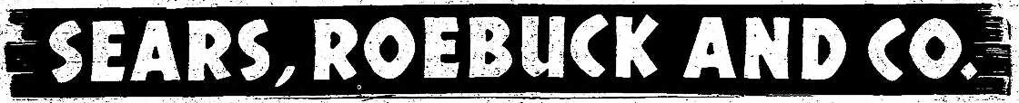
Sears, Roebuck & Co.
1930–1945
SVG NEEDED
LOGO MISSING
As retail operations began to quickly outpace Sears' catalogue business, the company dropped the "retail stores" distinction from the chain's name in 1930. During the 1930s and 1940s, Sears displayed its name in various type styles, a common practice around this time[1].
1945–1960
1945–1949
1949–1960
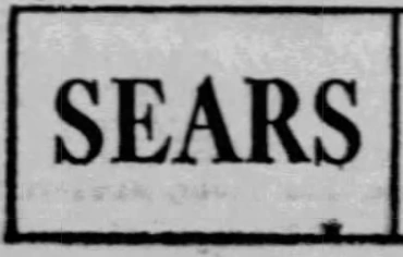
1953–1960; 2007–2018 (store concept)
Starting in 1953, storefronts would begin to simply display the name as Sears.
In 2007, Sears unveiled a "classic" store concept located in Duluth, GA, using this logo. Its use was stopped again after the store concept shut down in 2018.
1959–1965
SVG NEEDED
Sears
1961–1965 (secondary)
BETTER LOGO NEEDED
This was the earliest iteration of the box logo, and was used as a secondary in the footer of newspaper advertisements. It was around this time that its shortened name became more prominent.
1964–1984
1964–1968
Sears began using a modified version of its parent company's 1961 box logo in 1964.
1968–1981
1981–1983; 1983–1984 (secondary)
This was still used as a secondary logo in the latter half of 1984.
1983–1984 (primary)
1984–2004
1984–1994
Designer:
Mike Samuel for Robert Gersin & Associates
Typography:
Neue Helvetica 96 Black Italic
Launched:
July 1, 1984
According to an AP article from June 30, 1984, Robert Gersin (president of Robert Gersin & Associates), said of the old logo:
“... the old logo was limited in terms of the size, colors, and symbols that could be placed alongside it.”
— '
According to Gersin, the new typeface was designed to be versatile, bold, and progressive. The letters themselves - all capitals - display strength and boldness. They were italicised "to suggest a sense of controlled forward motion". The main challenge, according to Gersin, was to make it work on a variety of products, from dresses to tractors.
“We modified it with a line that can carry color. And the color of the stroke can be varied. It can be very soft and light without appearing weak. Or it can be very bold and strong without appearing ungraceful.[2]”
— '
This logo can now only be found at the Burbank, CA, location and on the interior entrances to the Sears in Hato Rey, Puerto Rico.
1994–2004
Designer:
Unknown
Typography:
Neue Helvetica 96 Black Italic
Launched:
October 1, 1994
This is a modified version of the 1984 logo, first used by Sears HomeLife furniture stores on September 24, 1994. It was not rolled out as an official logo until October 1st of that same year. This logo was still used by the Mexican division until 2013, when its color changed to red (to better distinguish it due to different ownership). It is the most widely seen Sears logo in the United States despite being succeeded by four other logos, appearing on six of the ten surviving locations.
2004–2010
Designer:
Unknown
Typography:
Neue Helvetica 96 Black Italic
Launched:
November 11, 2004
In November 2004, following Sears, Roebuck and Co.'s merger with Kmart Corporation and the creation of Sears Holdings, Sears adopted the mixed-case wordmark that had been used by their Sears Grand concept since September 2003. As of April 2024, the Whittier, CA, store is the last to feature this logo, though it is still used on the dormant Sears Archives website. Sears Essentials kept this logo until its last location shuttered in 2011, Sears Canada used it for its operations until 2016, and Sears Centre’s logo went un-updated until 2020.
2010–2019
Designer:
Unknown
Typography:
Neue Helvetica Pro 35 Thin
Launched:
October 2010
In late 2010, the wordmark was completely overhauled, this time dropping the capital from the first S and drastically decreasing the type’s weight. Only the Braintree, MA, and Tukwila, WA locations use this logo, as well as Sears Outlet and Sears Optical until 2020. Coincidentally, this looks very similar to a Canadian alternate logo used in the late 1980s.
2019–present
2019–2020
Designer:
Unknown
Typography:
Nimbus Sans (modified)
Launched:
April 30, 2019
Sears' logo changed to a more positive image after emerging from bankruptcy in early 2019 under a new parent company called Transformco. The Sears wordmark was bolded, and a symbol known as an "infinity loop" was added with a light green gradient. They also introduced a new slogan, "Making Moments Matter".
2020–present
Designer:
Unknown
Typography:
Nimbus Sans (slightly modified)
Launched:
January 29, 2020
On January 29, 2020, Sears' logo was updated with the wordmark being lightened (more closely matching the logos from before 2019), and the icon was slightly modified. The "loop" was removed, making it resemble a house, or "home." It is not explained why this change was made, though it is possibly due to the previous logo looking too similar to Airbnb's. Neither this logo nor its predecessor appears on any physical Sears location.