1989-????
????-1998

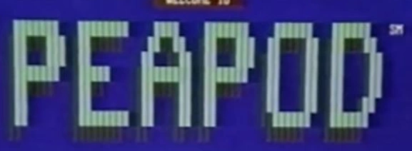
1998-1999

1999-2001
While the internet started gaining popularity, Peapod added a '.com' to their logo.
2002-2012

In 2002, the '.com' was removed.
2012-2016

In 2012, the shadow was removed from the logo and the gradient on the 'o' became lighter.
2016-present
In 2016, the logo was flattened for a cleaner, more modern look.