| 1995–2001 | 1996–2016 (secondary) | 2001–2010 | 2010–2012 | 2012–2023 (primary), 2023-present (secondary) | 2023–present (primary) |
1995–2001

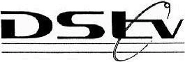
On October 6, 1995, MultiChoice, a subsidiary company of Naspers, launched the Digital Satellite Television platform, popularly known as DStv.
On launch, this logo features the DStv signature byline with the trademark symbol and a crest-shaped rainbow above it/them. The slogan, "so much more" (which was adopted in 2001), is shown underneath the byline.
")
")
1996–2016 (secondary)
| SVG NEEDED |
Registered in many countries' patent offices in 1996 by Pay TV Properties N.V., some are now owned by Canal+ Europe B.V., MIH Intelprop Holdinh Limited or MergedPersonTM.
- 1996-02252 - Sweden, owned by Pay TV Properties N.V.
- F128602 - Greece, owned by MIH Intelprop Holdinh
- M9600695 - Hungary, owned by Canal+ Europe B.V.
- 44818 - Cyprus, owned by MergedPersonTM
2001–2012
2001-2010

The second logo had the DStv byline shown in black-and-white gradient with a blue left-facing curve covering around the left side of the logo in an anticlockwise direction. The crest-shaped rainbow above the trademark symbol was dropped in 2005 on-screen but would still be seen off-screen until the logo below was introduced.
2010–2012
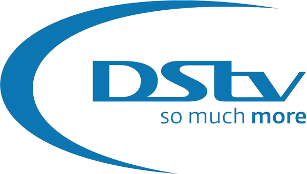
The third logo had the DStv byline and the slogan colored blue and the rainbow dropped alongside the trademark symbol.
Unlike the 1995 logo, this attaches the DStv alphabets so close that it joins in a designer line form. The blue curve is modified to a top-left facing.
2012–2023 (primary), 2023-present (secondary)

On 2012, the arc was removed, leaving only the wordmark. It was accompanied by a new slogan Feel Every Moment until 6 December 2020 when it was changed to It's your moment!
The change was intended to not only reflect the new feeling and excitement but also to keep in line globally recognized channels and have more access to mass entertainment. With this logo, variations came out thick and fast for the first time in the brand's history.
")
")
")
")
")
")
")
2023–present (primary)

The wordmark remains the same, but is now encapsulated in a blue, “D”-like shape with rounded corners.
")
External links
| Part of Canal+ Group
Television and streaming services: M-Net channels:
1Magic | Africa Magic (Showcase Family | Epic | Hausa | Yoruba | Igbo) | KykNET (& Kie | Nou) | Me | Maisha Magic (East | Plus | Bongo) | M-Net Movies (1 | 2 | 3 | 4) | Mzansi Magic (Music | Bioskop | Wethu) | Novela Magic | Zambezi Magic | Pearl Magic | 1KZN TV | Akwaaba Magic | OneZED SuperSport channels: Other assets: Defunct channels and properties: |
