Home Box Office (HBO) launched on November 8, 1972, on the Teleservice Cable (now Service Electric Cablevision) system in Wilkes-Barre, Pennsylvania. The network originally operated as a regional pay television service, distributed via microwave relay to cable television systems within the Northeastern United States.
January–March 1973
Designer:
Unknown
Typography:
Unknown
Launched:
January 9, 1973
1973–1975
Designer:
Unknown
Typography:
Custom
Launched:
March 1, 1973
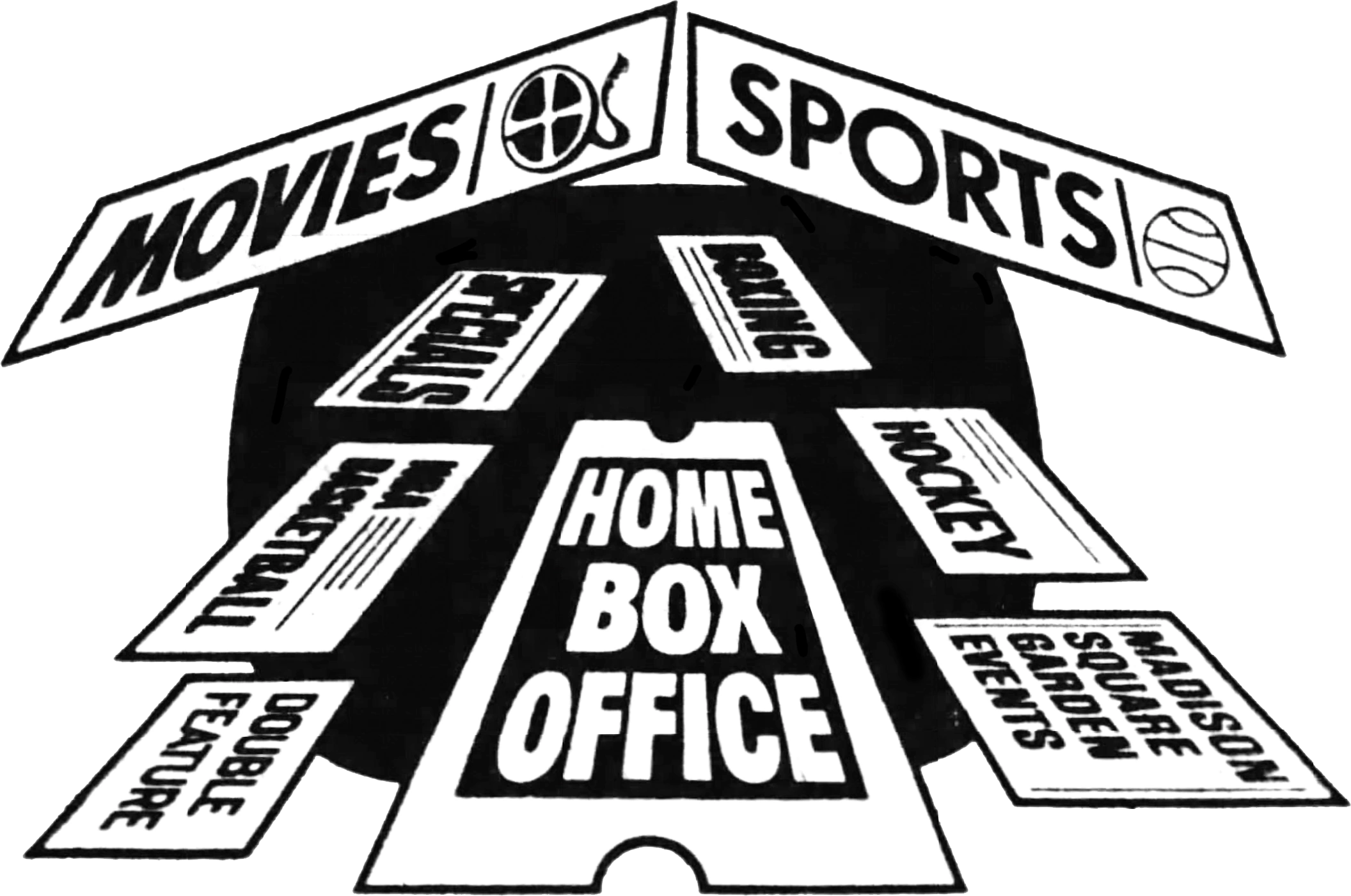
At this time, HBO identified itself with a still image of its original logo, a ticket stub, and the channel's full name, Home Box Office, surrounded by a minimalist marquee light design.
1973
SVG NEEDED
HBO
1975–1981
Designer:
Betty Brugger
Typography:
Custom
Launched:
May 1, 1975
HBO's logo has looked essentially the same since May 1, 1975, utilizing a simple wordmark with a circle inside the "O", representing a camera lens. This version differs, however, in that it had the "O" overlapping the "B". In network IDs, the logo was often accompanied by three lines colored red, yellow, and blue, below or next to it. This logo was designed by Betty Brugger, then the art director for Time-Life.
HBO became the first television network to transmit via satellite on September 30, 1975, when it broadcast the "Thrilla in Manila" boxing match, which saw Muhammad Ali defeat Joe Frazier by corner retirement in the 14th round, via the Westar I to subscribers of UA-Columbia Cablevision's Fort Pierce and Vero Beach, Florida systems and American Television and Communications's Jackson, Mississippi system.
This logo was initially used in tandem with the previous version until July 1981. A major reason for this change was that the partially obscured "B" of the previous logo gave many the impression it was an "E". Also, the letters in the logo were trimmed to be slightly less bold, and the spaces between letters and around the circle in the center of the "O" were widened.
1 Most channels distributed in Spanish-speaking Latin America by Ole Distribution. Brazil distribution and marketing are handled by Globo; except for Universal+, E! and DreamWorks, whose Brazilian versions are also operated by NBCUIN&DTC LATAM and distributed by Ole Distribution 2 Except in Mexico, where distribution are handled by Televisa Networks
Movies: Kryminalni: Misja śląska | Listy do M. (1 | 2 | 3 | 5) | Świadek koronny
TVN7:
Shows: 40 kontra 20 | Anatomia piękna | Bez kompleksów | Big Brother (2019) | Ewa Sama piecze | Hotel Paradide | Klub Przygód | Królowa przetrwania | Kto odmówi pannie młodej | Mówię wam | One night squad | Perfect picture | Projekt Lady (2021) | Ślub od pierwszego wejrzenia (2020–present) | The Trip | True Love | Żony Miami
Soap operas and series: 19+ (2020–2022) | BrzydUla 2 | Mamy to | Papiery na szczęście | Reguły gry | Zakochani po uszy
Docu-soaps: Opowieści małżeńskie | Szkoła (2020) | Ten moment | Wycieczkowiec | Zagadki losu
Other programs: Festiwal piosenki filmowej | Magia świąt | Nasza kolęda | Szczęśliwa Siódemka | Top model po finale
TVN24: 15 na żywo | Bez Kitu | Czarno na białym | Dokument w TVN24 | Dzień na żywo |
Dzień na żywo | Dzień na żywo | Fakty (o świecie | po Faktach | po południu) | Horyzont | Jeden na jeden | Kawa na ławę | Kropka nad i | Loża prasowa | Polska i świat | Ranking Mazura | Rozmowa Piaseckiego | Serwis informacyjny | Superwizjer | Szkło kontaktowe | Tak jest | Wstajesz i Wiesz | Pamięć absolutna | 24 godziny | Babilon | Barometr | Bilans tygodnia | Blisko ludzi | Bohater tygodnia | Cały ten świat | Ciąg dalszy nastąpił | Dama pik | Droga do Euro | Drugie śniadanie mistrzów | Dwie prawdy | Europa, co dalej? | Fakty w południe | Firma | Gość poranny | Inny punkt widzenia | InterNET24 | Kalejdoskop tygodnia | News in English | Nieruchomości | Ona i on | OnetLink | Piaskiem po oczach | Portfel | Prasówka | Prosto z Polski | Prześwietlenie | Publiczna.tv | Raport wieczorny | Rozmowa Rymanowskiego | Serwis ekonomiczny | Skaner polityczny | Sprawdzam | Sukces pisany szminką | Świat reporterów | Teleserwis | Teraz my! Dogrywka | Traffic | Tu Europa | Wydanie II poprawione | Xięgarnia
TVN Style:
Programs: Pani Gadżet 2.0 | Mistrzowskie cięcie | #Sława | Pojedynek w modę | Gwiazdy od kuchni | Gwiazdy prywatnie | W czym do ślubu? | W roli głównej | Wiem, co jem i wiem, co kupuję | Pani Gadżet | Dorota Was urządzi | Afera fryzjera | 66 naj... | I nie opuszczę Cię aż do ślubu | W dobrym stylu | Apetyt na miłość | Co nas truje | Misja ratunkowa | Eks-tra zmiana | Poczuj jak Małgosia Rozenek | Zaskocz mnie | Zanim cię zobaczę | 10/10 | Jestem z Polski | Stylowy Projekt | Dieta czy cud? | Ach, ten ślub! | Studio urody | Związki z modą | Człowiek przyszłości | Śluby świata | Kanony piękna na świecie | Warsztaty świata | Kto tu mieszka? | Co słychać?
Documents: Kuźniar w Rio | Trzy na godzinę | Szalone Tokio
Docu-soaps: Idealna niania | Sprzątaczki
Other programs: Miasto kobiet
TVN Turbo: 101 napraw | 101 gadżetów motoryzacyjnych | 99 godzin | Absurdy drogowe | Agromachina | Automaniak | Ale jazda | Będzie pan zadowolony | Ekipa garażowa | Emil - łowca fotoradarów | Nowy Gadżet | Gwiazdy czterech kółek | Jak z niczego zrobić coś | K2 – kierowców dwóch | Klimek kontra Duda | Kup i zrób samochód marzeń | Legendy PRL | Odjazdowe bryki braci Collins | Miejski Superbohater | Moto ON | Niebezpieczne Dzielnice | Pierwszy samochód | Raport końcowy | Raport Turbo | Sam tego nie rób | Samochód marzeń | Science show | Służba więzienna | Top Wings | Turbo Kamera | Usterka (2025–present) | Uwaga! Pirat | Wojny samochodowe | Wstęp wzbroniony | Zakład karny | Zakup kontrolowany | Zakup kontrolowany za granicą | Zawodowi handlarze | Złodzieje | Kolekcjoner | Klasyka Patryka Mikiciuka | Dawid Anders z buta | Naprawy nie do naprawy | Gadżet 4.0 | Jeździć, obserwować | Puchar Polski | Liga Europejska
TTV:
Newscasts and daily programs: Express | Pogoda | Prosto ze skoczni | Raport alergiczny | Raport smogowy | Sport
Shows: 10 wizyt Michela Morana | 10 zadań specjalnych Michela Morana | 7 grzechów | 99 - gra o wszystko | Damy i wieśniaczki PL | Diabelnie boskie | Dżentelmeni i wieśniacy | Idź na całość! (2025-present) | Jak się ubierać w kryzysie? | Googlebox. Przed telewizorem | Królowe życia | Nie do wiary (2012–2013) | Odezwiemy się | Studio TTV | Testerzy | Usterka (2013–2023) | Zakup w ciemno | Żony podlasia | Życie na kredycie
TVN Gra: Rozbij bank | Kasa gra | Wieczorne igraszki | Graj o raj | Garitto | Foto gra | Wrzuć na luz | Misja specjalna | Strażnik kasy | Gra wstępna | Wyścig po kasę | Kryminalne zagadki | Seans filmowy | Zabawa od kuchni | Turbo granie | SerwisMania | Music chat | Wieczór wróżb | Laski na czacie | Hej-nał show | Fabryka gry | Wykręć numer | Diablo i Angelo | Granie na ekranie
TVN Lingua: Therapidiom | Na słówko | W gorącej wodzie company | Chatter Box | Hit The Bank | Zabawy z języczkiem | Mission Possible | Lesson With a Star | Party To Learn | Spikerzy z licencją na nauczanie | Wordwise | Everyday English | Fly My Deer | Slanguage | Bobby the Snail | Pupilek | Vipas | Underground | Zoom | Gabinet Figur Wioskowych
TVN Warszawa:
Newscasts and daily programs: Miejski Reporter | Stolica | Witaj Warszawo
Programs: Rytm Miasta | Odrobina Miasta | Jazda Warszawska | Taxi Story | Nasza Legia | Komenda Stołeczna | Kupujemy | Nieruchomości | Smaki Miasta | Styl Warszawski | Storyboard | Twój Wybór | Dom Deco | Z Lotu Ptaka | Za Kurtyną | Filmowa Warszawa | 2 Dni Wolnego | Spotkania Doroty | List Gończy | Błyskawiczny Program Historyczny | Coś dla siebie | Doktor Łapa | Goście Goście | Serial w Wielkim Mieście